Senior Samsung designers have revealed details behind the choice of the Galaxy S5 design concept. The information came into light through a blog post on the official Samsung blog. This is just after another post of Samsung bragging about the Galaxy S5 magnificent display.
The Samsung Galaxy S5 design draws its inspiration from the ‘Modern Flash’ concept. Samsung describes the Modern Flash concept as a ‘sophisticated and youthful urban style with emotion’.
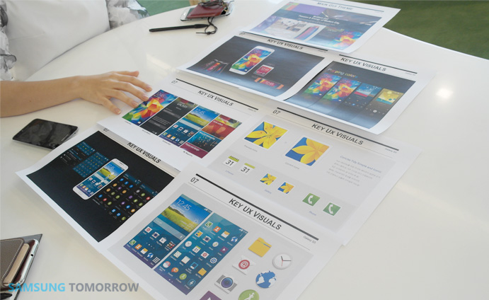
Samsung also dropped the images of nature as its key UX and instead chose to use an abstractive geometrical pattern. The design team went into the nifty details when selecting the frame colors of the Samsung Galaxy S5.
It was so important they get the colors right, that the selected colors had to go through a series of intense lab tests to confirm their appearance on the S5 Super AMOLED display. There was also a revamping of the icon set of the S5 to make them look cleaner and simpler.
Samsung Galaxy S5 designers also decided that a reduction of pre-installed Apps of the S5 will be the perfect complement for the refined interface. The design team also sorted through a couple of materials to decide which will offer a fine comfortable grip.
Sheepskin Leather emerged victorious in that contest. The design team added that the use of a shimmery surface was a move to attract the younger section of Smartphone users.
‘After extensive research, they found out that the luster of the color that appeared softly was appealing to consumers in their twenties and thirties’.
Now watch the Samsung Galaxy S5 fight off a hilarious hammer test
Source: [Samsungtomorrow]
Kevin is a tech enthusiast and the lead writer at MobiTrends.co.ke. He has been writing about smartphones and tech related topics since October 2012. About Us | Contact Us


